Have you ever wondered why Japanese web design is so different from that in the West?
The weird world of Japanese web design
Author: Erika
Japan Italy Bridge offers services for companies and part of our job is to create websites. “What’s new” you might say, yes because there are so many agencies like us, but what makes us different from the others? Well, we have the ability to adapt the Japanese style and visual to Western-style and vice versa.
It is very, very important for every company to have a website that represents their brand. However, it often happens that the style and design we use in Italy is not really suitable for the Japanese language and people.

In fact, if we analyze even just visually the Japanese sites, the differences immediately jump out at us.
As we know, in most of the Western world, websites have a simple layout. In fact, compared to the early 2000s, we have replaced the myriad of links with relevant and concise content that quickly leads us to our goal.
However, there is also a different culture in Japan in terms of visual taste. In fact, some websites have changed very little since the early 2000s. In this respect, we can really see how different sites are overloaded with links and information. This is totally inconceivable for a Western eye, while it becomes the norm for a Japanese one.
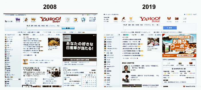
Yahoo was one of the most popular search engines in Japan and still is for many homepages. However, as you can see from the photos, its design and layout have changed very little in the last 10 years.
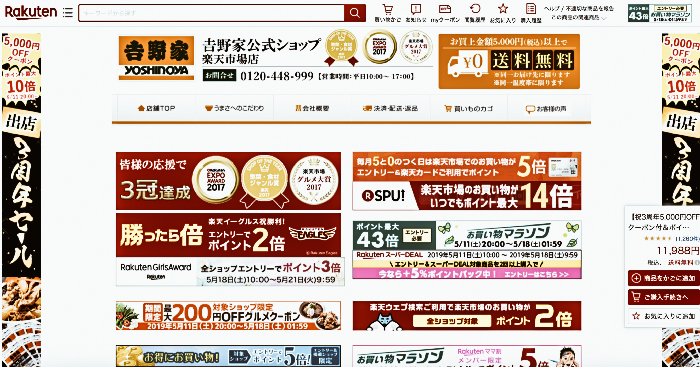
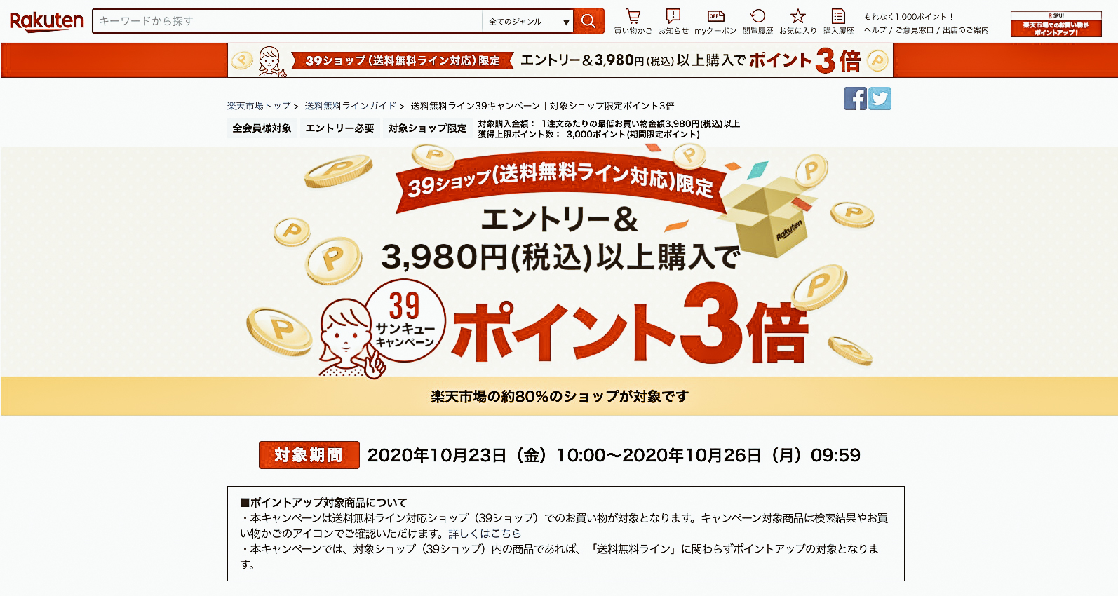
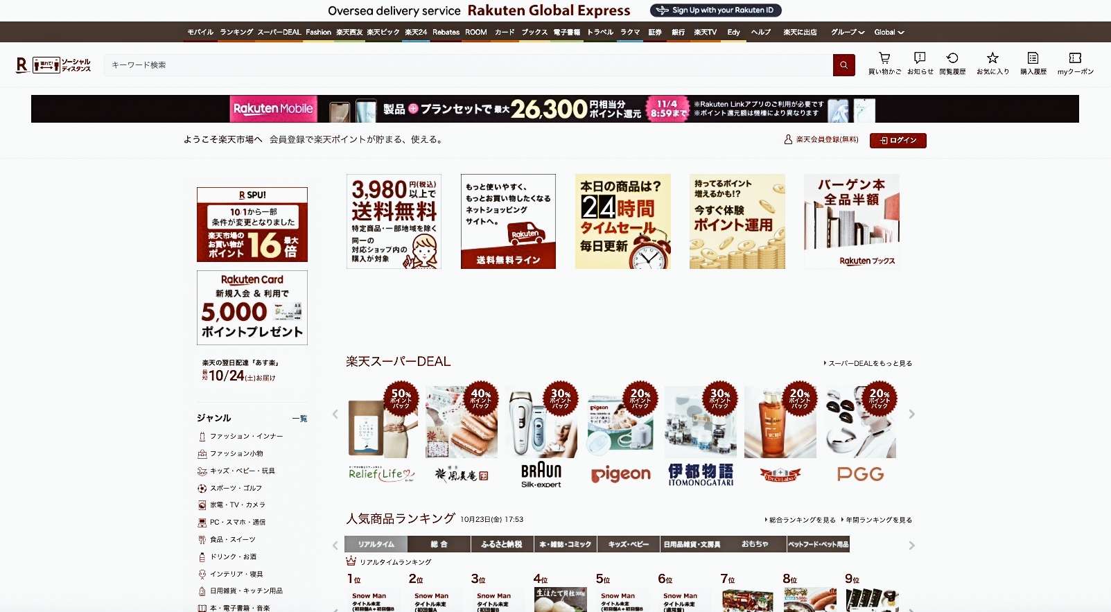
Another example is the homepage of Rakuten, the nation’s largest online shopping centre.
Rakuten is the Amazon of Asia and every shopkeeper can customize their own page. This results in a large display of various images, banners and pop-ups on different pages that sometimes take a long time to scroll through.
Why is Japanese Web Design like this?
But here’s the real question, why does web design in Japan have to follow these certain canons of style? The answer is simple. The majority of the Japanese people are older users who prefer to maintain the tradition. This also happens in the visual style of how websites are built and experienced.
This makes it complicated for companies to change to a style that we might call more international.
Moreover, most Japanese users use the internet via desktop and not mobile support. So even the biggest websites tend to keep the current design, also not to confuse the end-user.
Another reason why Japanese people prefer this style that we would call “old” is also because of their information culture. In fact, if you have ever been to Japan or seen some pictures of the country, you will have noticed that signs are omnipresent. The Japanese are bombarded with bright neon lights and signs that tell of shops, special offers, and occasions not to be missed. This also transpires on websites where the Japanese people prefer to have all the information immediately.
The LINE Case
When the LINE messaging app (the Japanese equivalent of Whatsapp) decided to change and simplify the layout of their homepage, the Japanese people did not take it very well. In fact, at that time, users went wild with one-star reviews and numerous requests to the company to change to the old design.
Change on the horizon
However, despite the preference for a more traditional approach, some young people in their 20s and 30s have stated that they prefer a more minimalist design.
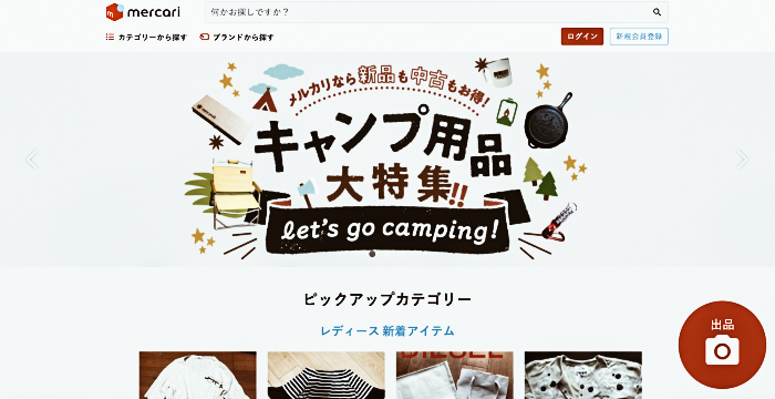
The Mercari case is in fact an example of this. We are in fact talking about a site that offers online auction services with a simple and user-friendly interface. In a short time, Mercari has taken over Yahoo Auctions, the most popular app in Japan for these services.
The history of this brand has shed light on the importance of a good UX layout, encouraging the Japanese to hire new designers on the verge of change.
Japanese companies will have to start adapting to a more modern design not only to be more attractive to a younger audience but also to become more competitive internationally.
If you liked this and our other articles, join our newsletter to receive exclusive updates and many new articles.
Share this:
- Click to share on Facebook (Opens in new window)
- Click to share on Twitter (Opens in new window)
- Click to share on Tumblr (Opens in new window)
- Click to share on Pinterest (Opens in new window)
- Click to share on Telegram (Opens in new window)
- Click to share on WhatsApp (Opens in new window)
- Click to share on Reddit (Opens in new window)
- Click to print (Opens in new window)


